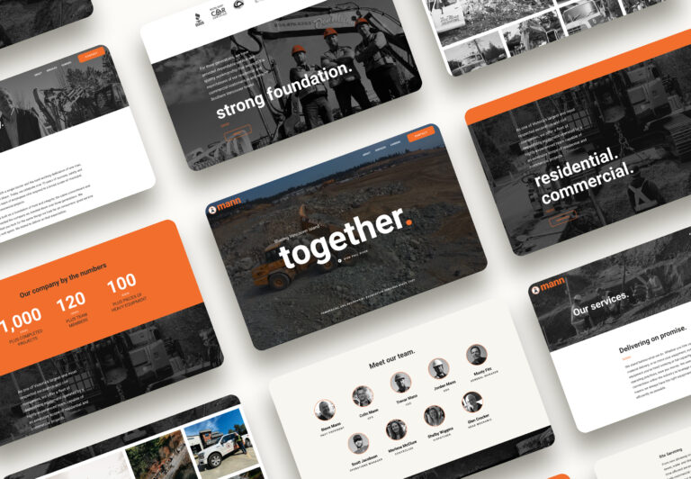
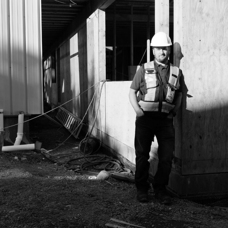
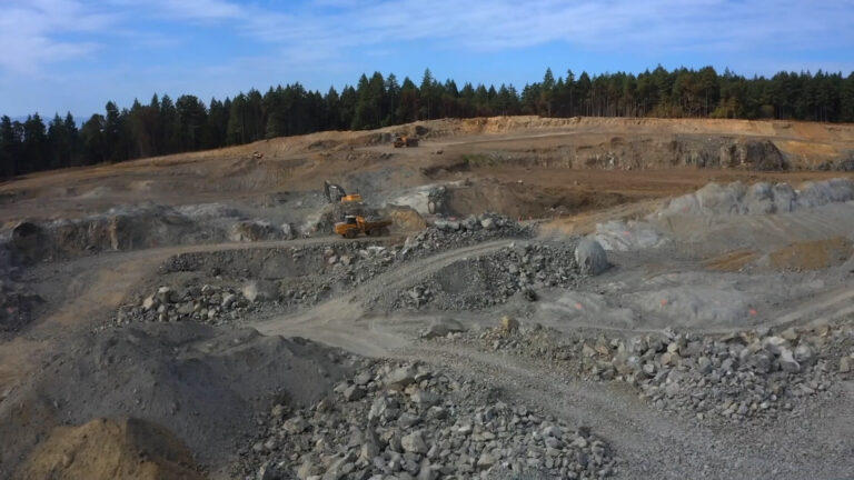
A company that’s been successfully serving commercial and residential clients across Vancouver Island for 75 years, Don Mann Excavating was in transition: the third generation of the Mann family was taking ownership, and the brand was in need of a refresh. Our goal was to communicate the company’s status as an industry leader while paying tribute to the people and history at its heart.
Honouring a Family Legacy
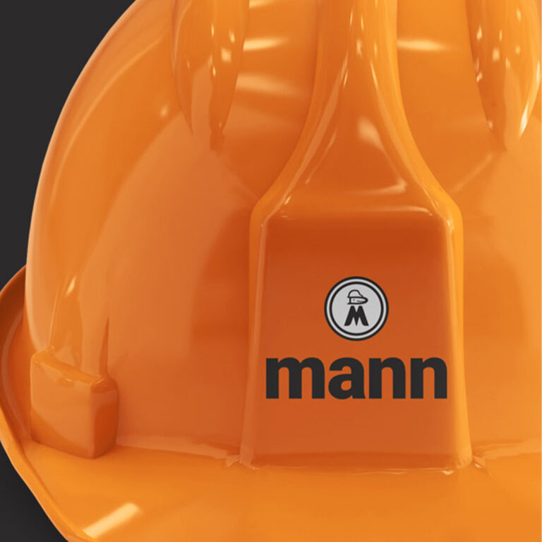
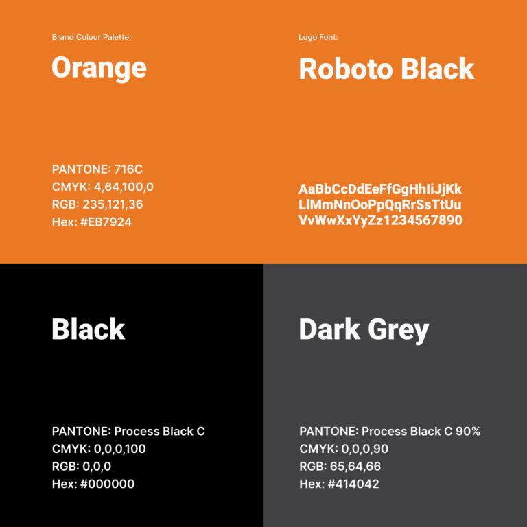
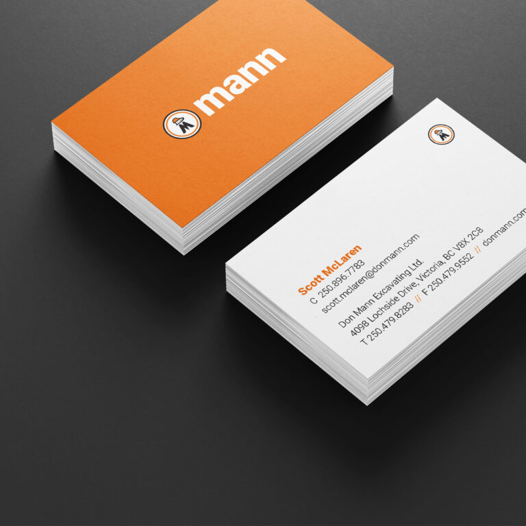
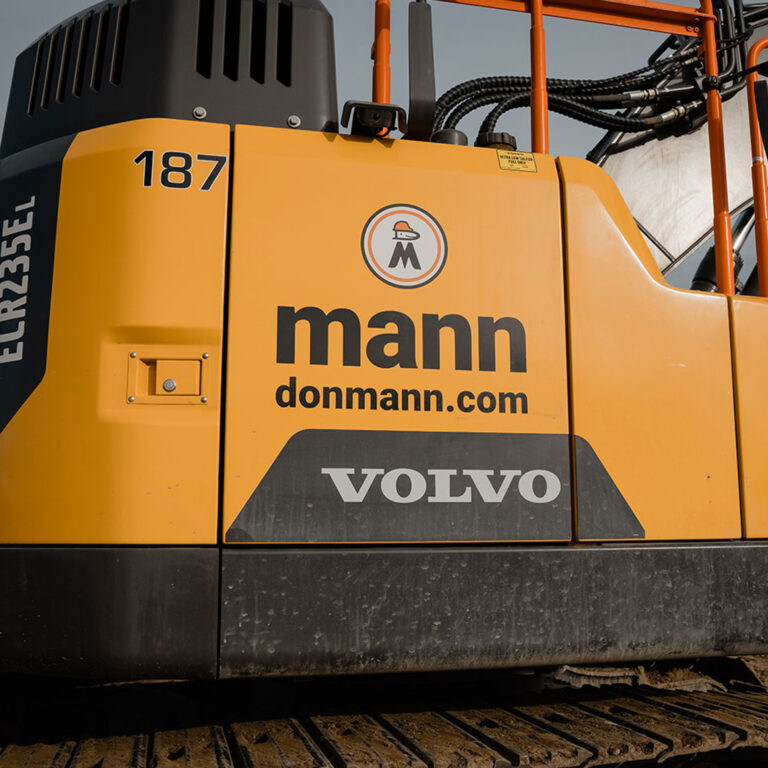
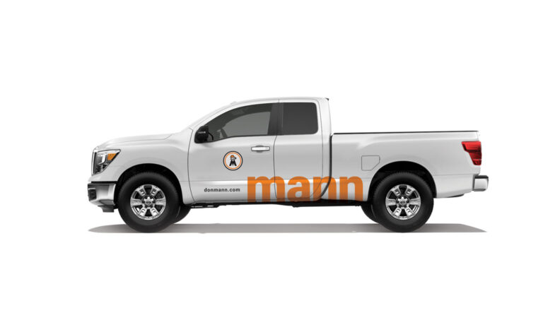
Since the logo held such importance for the company, we opted to retain its most recognizable elements while standardizing and simplifying it. Now only one word—Mann—sits below the smiling face wearing a hardhat, and the result is a contemporary and confident logo designed for many more decades of use on trucks, hardhats, and equipment.
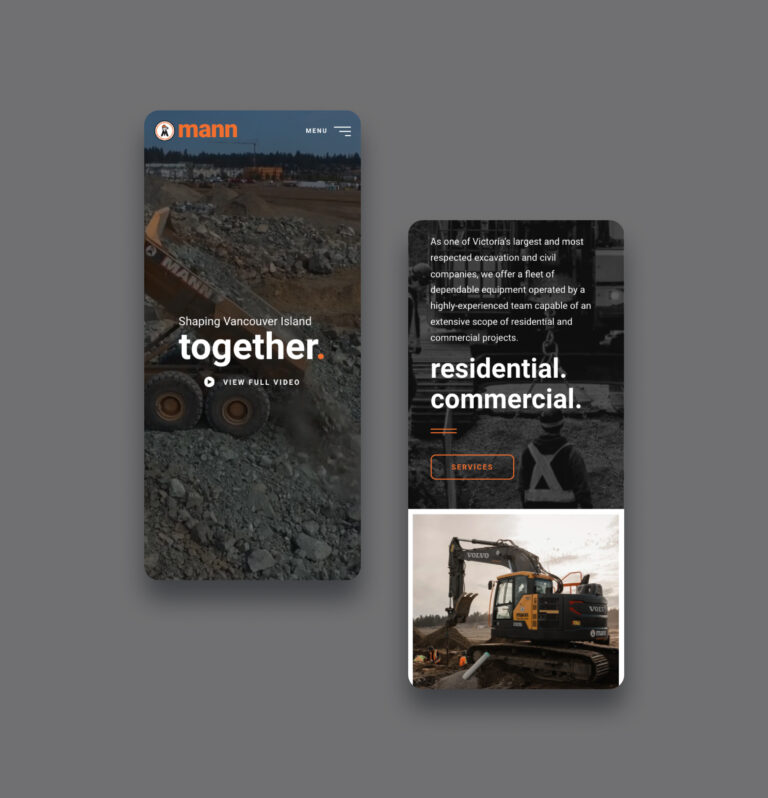
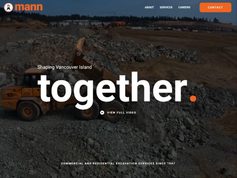
A Sleek and Efficient Digital Presence
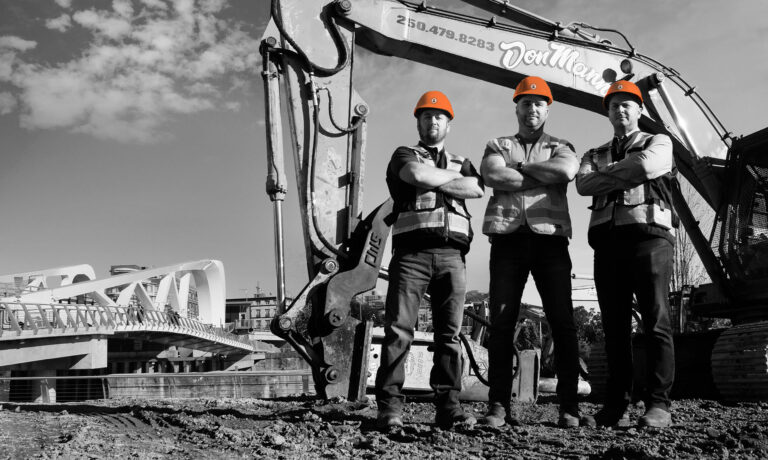
The Don Mann website communicates the family story and the company’s many successes while foregrounding their team and impressive fleet. And it does all this with great efficiency: the new Don Mann site is a sleek, thoroughly accessible encapsulation of the brand.
