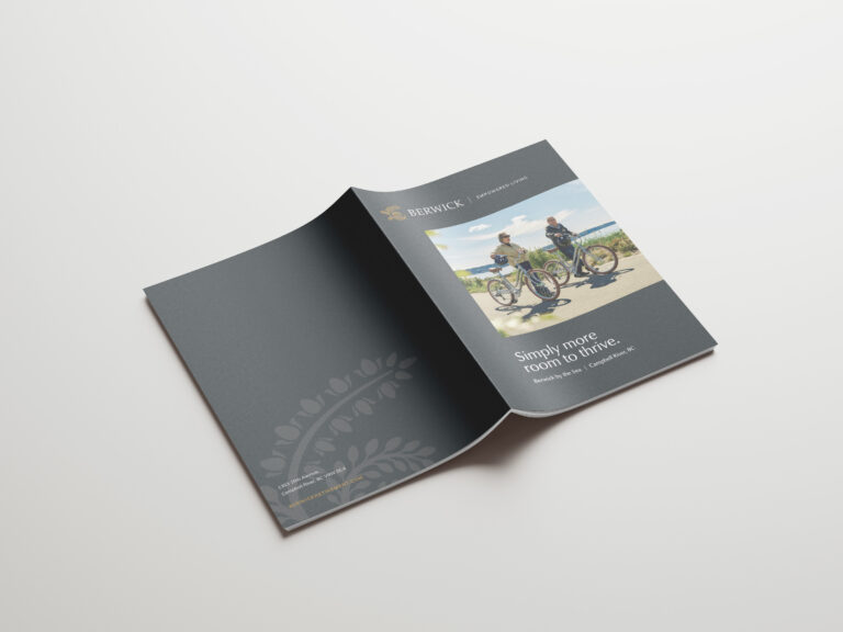
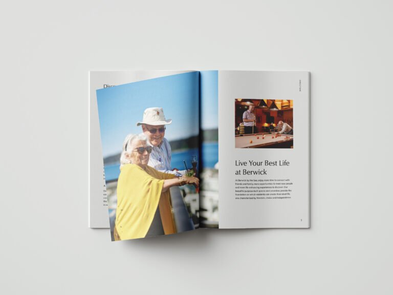
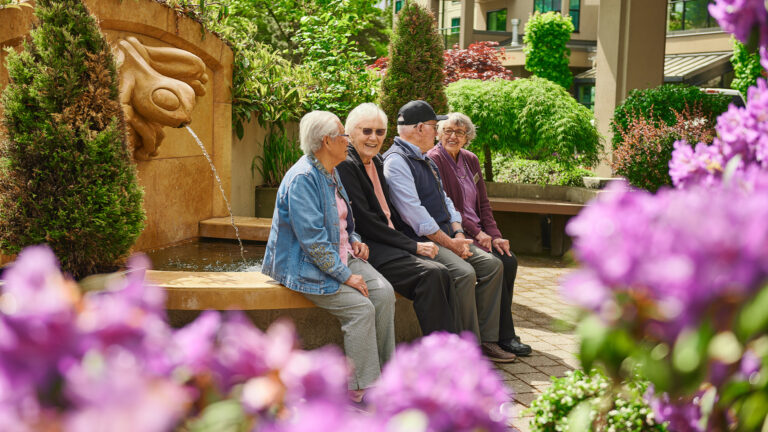
Since 1989, Berwick has created senior living communities that take excellence as their starting point. From incredible purpose-built amenities, to dynamic wellness and recreation programming, to a team that exudes passion, Berwick has figured out how to foster vibrant communities where people can live their best life. We reimagined their branding for a contemporary audience and created an elevated, mobile-friendly web presence to ensure Berwick connects with new audiences seeking exceptional independent living.
Positioning the Brand for Continued Success
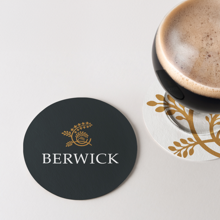
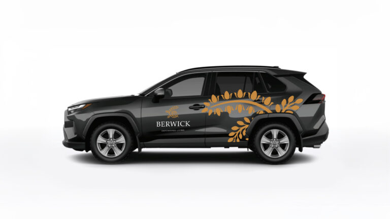
After conducting a deep dive into the brand with the Berwick team, we distilled their key differentiators, values, target audience, and vision in a comprehensive brand playbook. We refreshed the classic Berwick logo, cleaning up the emblem and placing greater emphasis on the Berwick name, a move that signals the brand’s confidence and name recognition in the industry. Complementing the logo is a suite of brand colours, which provide consistency across all of Berwick’s touchpoints.
A Tagline that Confidently Delivers the Brand Promise
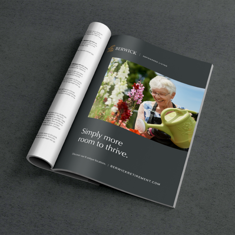
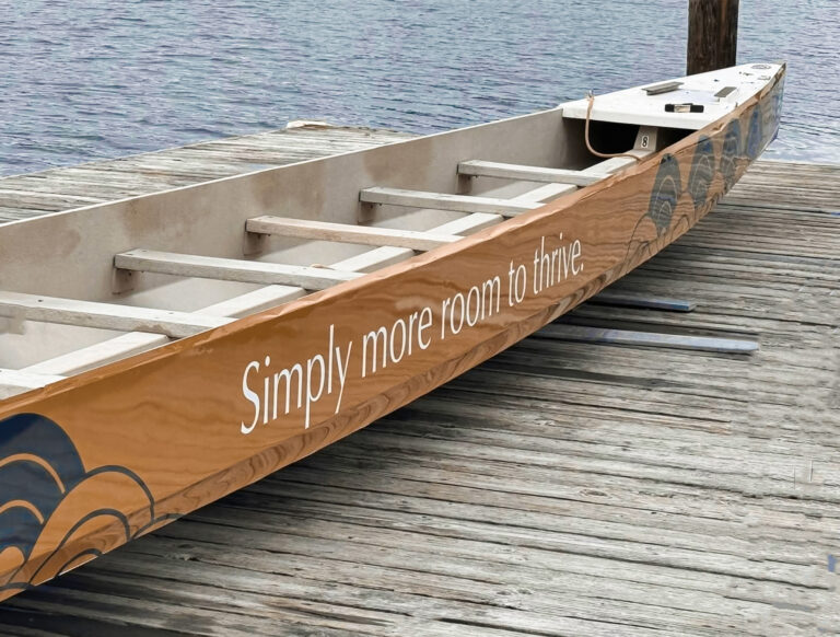
Moving from one’s long-time family home to a senior living community can be a big undertaking, but with Berwick the benefits are obvious—and residents often say they wish they’d made the move sooner. To capture everything that Berwick offers, particularly all of its purpose-built amenities, we created a tagline that states it clearly: “Simply more room to thrive.” At Berwick, residents are provided with more room in the form of beautiful spaces, which provide the foundation for a life of continued adventure and enjoyment, with more time for interests and more opportunity for connection.

A Web Presence Brimming with Authenticity
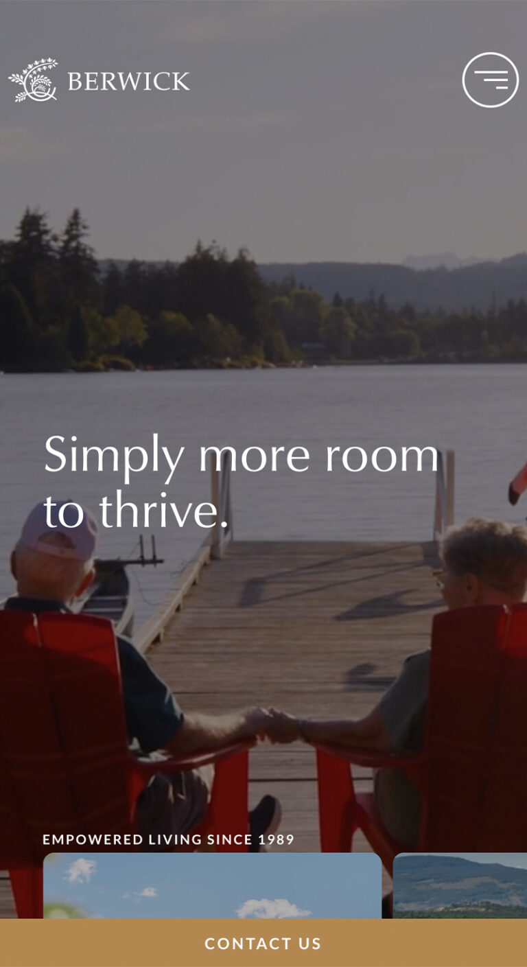
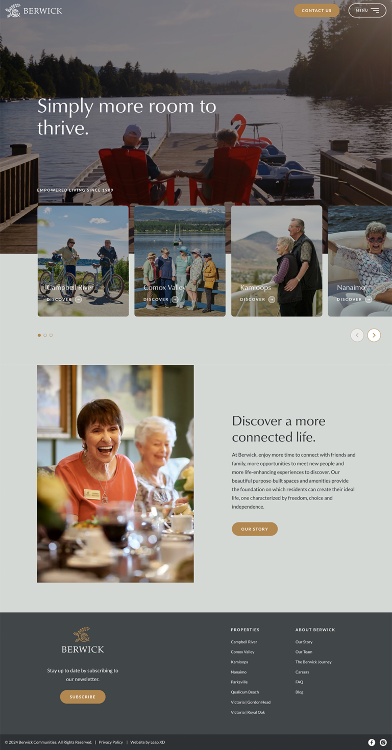
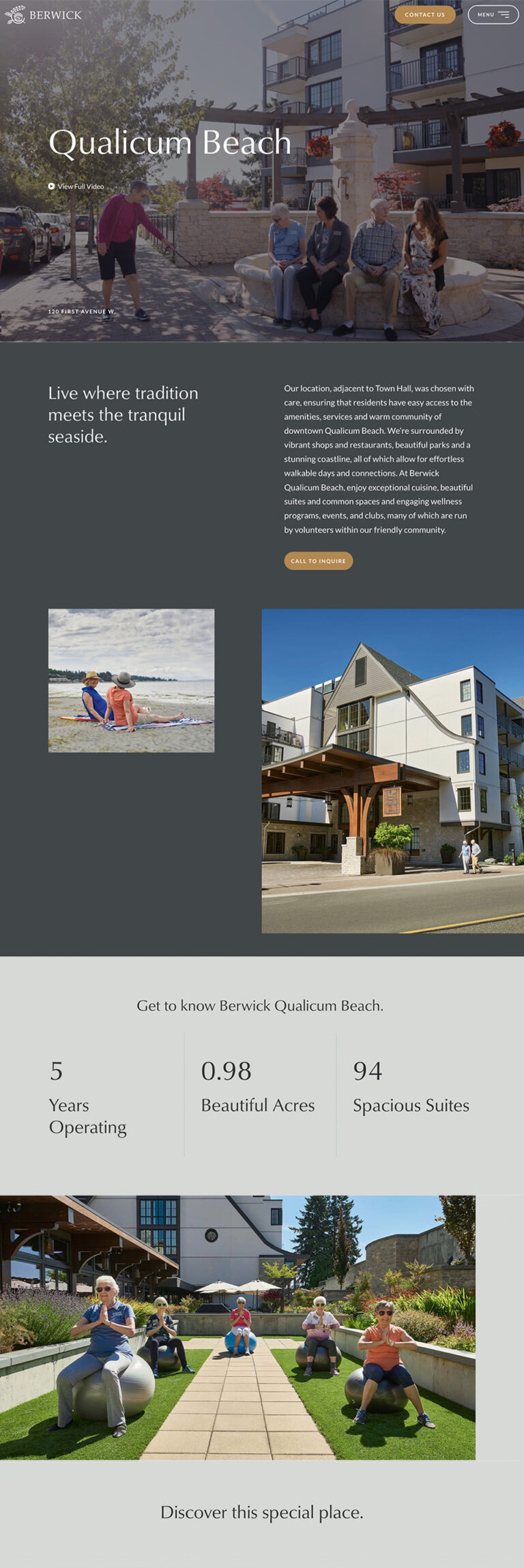
Since the Berwick website serves those looking for information about specific communities as well as those seeking to qualify the company itself, we essentially presented each community as its own microsite, with sections dedicated to an overview, suites, amenities, community programs, dining, and the neighbourhood. We also created pages dedicated to the brand itself, where visitors can learn about Berwick’s philosophy, history, and team. This approach allows each community to offer unique content while maintaining an overarching brand presence.
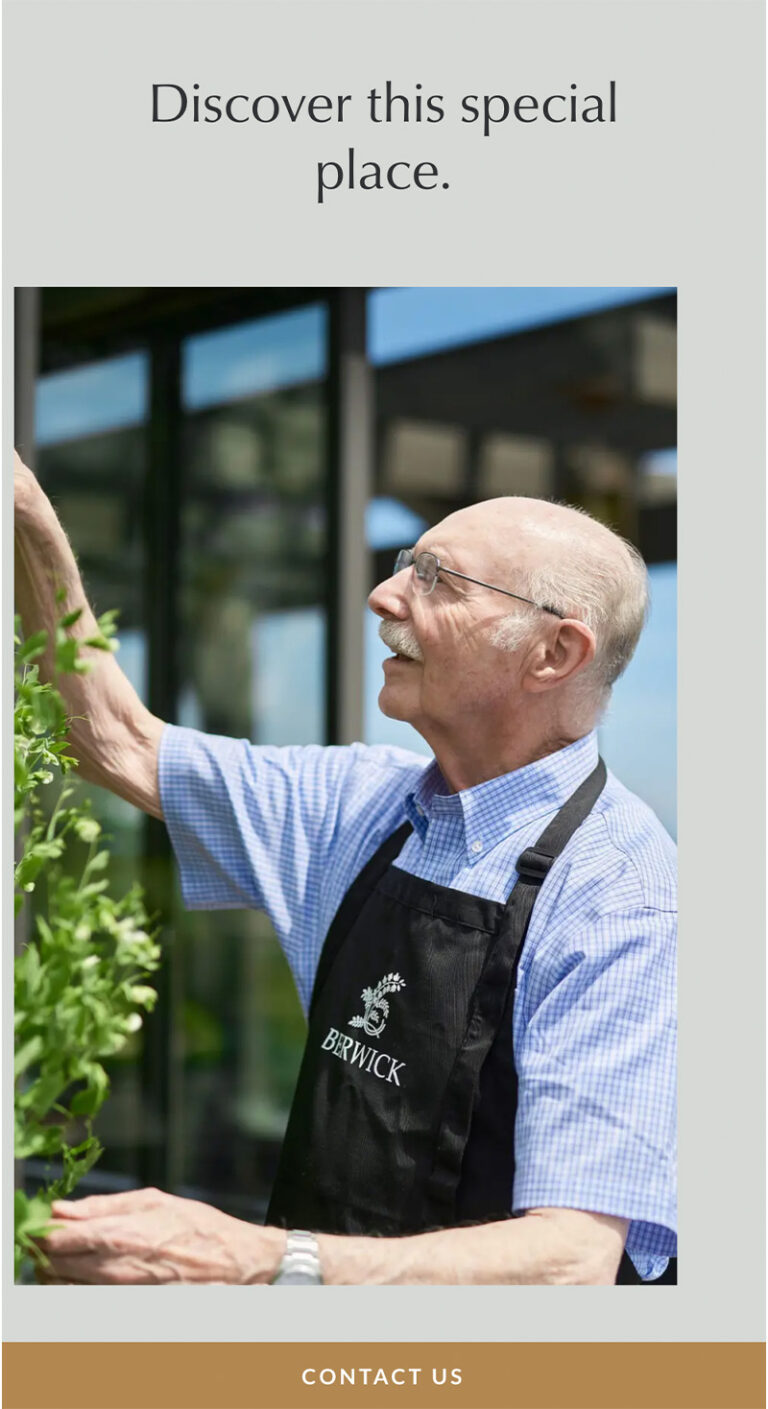
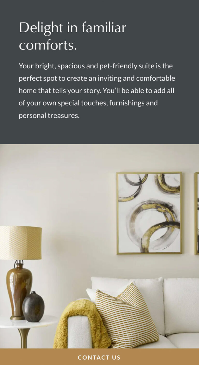
The website’s look and feel is warm and contemporary, embracing generous white space, large text, and an elegant continuous scroll. Throughout the site, immersive video and photography filmed on location bring authenticity to the web experience, showcasing residents enjoying their beautiful surroundings, pursuing their interests, and making lasting connections.

Perfectly On-Brand Marketing Collateral
We translated Berwick’s new look and feel to its brochures and advertisements, putting the lifestyle photography featuring Berwick residents and team members front and centre. Informative and concise copy presents viewers with everything they need to know, whether they’re looking to learn about Berwick’s Assisted Living Services or getting to know a specific community through its large-format brochure. Consistent and cohesive marketing materials, graced with thoughtful design and messaging, better reflect Berwick’s offerings and increase brand awareness and recognition.
