Reflections from the Team
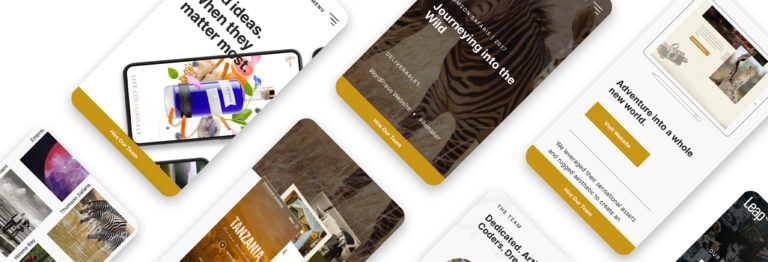
It’s 2021, our ninth year in business, and we’ve come a long way. What better way to celebrate our bold ideas and bold clients than with a brand-new website?
Leap’s founder and creative director, Neil, felt it was important to apply the “practice what you preach” approach to our new site’s design and development. “Our goal was to set the highest standards for the modern user experience and employ best practices for web optimization,” he says. “The new site truly represents the brand, our depth of experience, and our incredible team.”
Designed to Be Bold
A Striking Visual Showcase
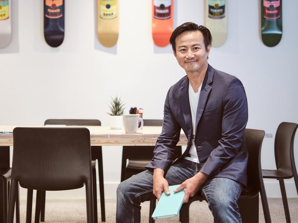
When designing our new site, Leap designer Kelly wanted it to feel celebratory. “We’ve worked on so many unique projects over the years,” she says, “that I wanted to create a site that highlighted our achievements as a studio and captured who we are now.”
To do so, Kelly placed the work front and centre, with engaging video, images, and copy telling each project’s story. She kept everything else fairly minimalist, using black text and generous white space to ensure visitors focus on what’s important. “Even the subtle animations,” she says, “show what we can do without being too overwhelming. Part of good design is knowing when to use restraint.”
An Interactive Experience
Since we’re big proponents of using video and large visuals in our storytelling, Leap designer Doug went the extra mile to translate our many different projects into one cohesive and larger-than-life video. “Video allows us to provide a fuller picture of what we did for our clients, really showing off all the cool functionality of their sites,” he says.
A Peek Behind the Scenes
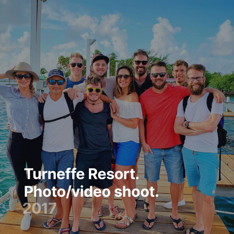
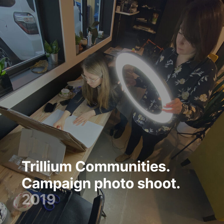
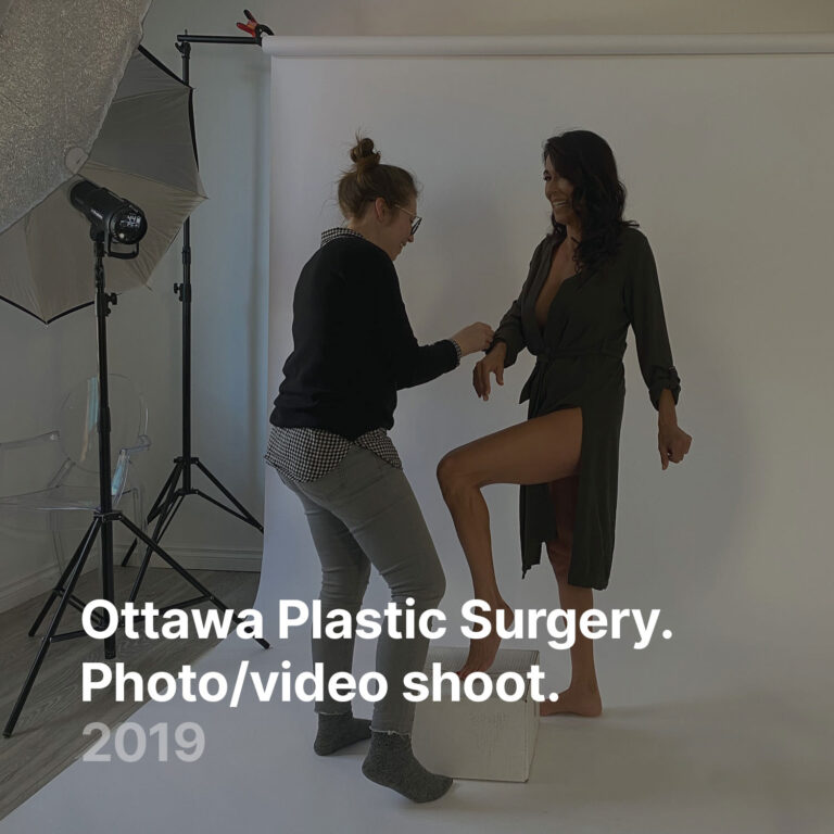
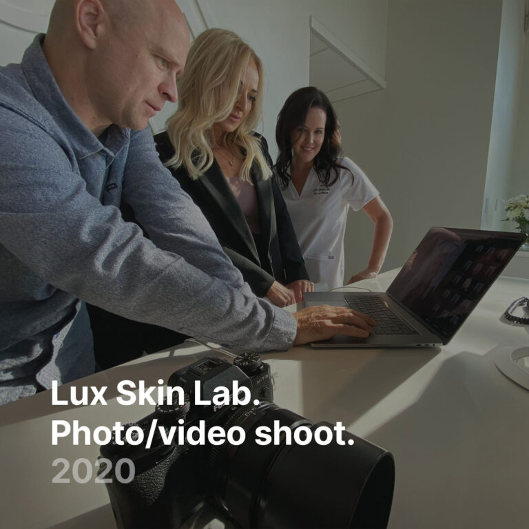
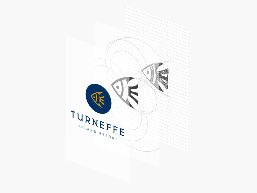
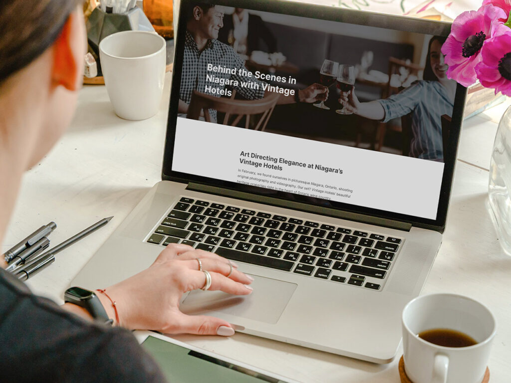
As our clients know, we’re all about process: we work in design sprints, recalibrate, iterate, and then execute. It’s a balance between creative play and streamlined project management. For our new site, we wanted to provide visitors with a glimpse into our studio work. According to Pip, Leap’s lead designer, “Good design looks effortless, but it’s the result of a lot of hard work.”
For this reason, she’s pleased that the new site communicates our process, from behind-the-scenes photos to logo sketches. “Part of our job is to demystify the design process for our clients,” she adds. “Even the smallest logo represents a great deal of research, planning, sketching, and experimentation.”
A Powerful Storytelling Platform
Concise and Compelling Copy
Stunning design calls for word-perfect copy, and for Leap’s new website, our writer Marisa was only too happy to oblige. “Even on a site so driven by visuals, written content plays a huge role,” she says. “It’s all about storytelling: helping visitors to the site understand the value of our services and the depth of our expertise, drawing out each portfolio project’s unique story, and providing a sense of our personalities—our warmth, collaborative spirit, sense of play.”
A Tribute to Great People
Leap XD may be all about striking design, innovative web solutions, and compelling content, but we’d be nothing without our clients. Geneva, responsible for Leap’s client care, agrees. “Our clients are a big part of who we are, so it was important to us that we not only highlight the work we’ve done for them but also showcase our relationships.”
Brandy, our studio manager, joins in. “It’s true that what makes this work so meaningful are the people,” she reflects. “When Pip and Kelly were creating the visual assets for the signature projects and logos, it felt like a trip down memory lane. I was reminded of each of our clients, the people behind the brands, whom I’ve had the pleasure of connecting with.” This includes our team, of course. “Visit our studio page. There you’ll meet the funny, kind, empathetic, and creative people who propel Leap and the brands we work with forward.”
Mobile Friendly, Fast, and Functional
Designed for All Devices
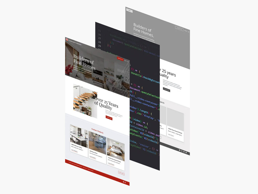
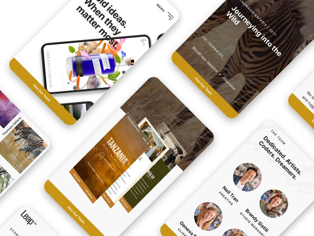
With our beautiful design and content in place, we needed the web development team to bring the website to life. Jade, one of Leap’s developers, built the site with one primary goal in mind: use a mobile-first approach. “I wanted mobile users to enjoy as interactive and interesting an experience as those using other devices,” she says. “The design integrity is carried through desktop, to tablet, to mobile.”
Lightning Fast
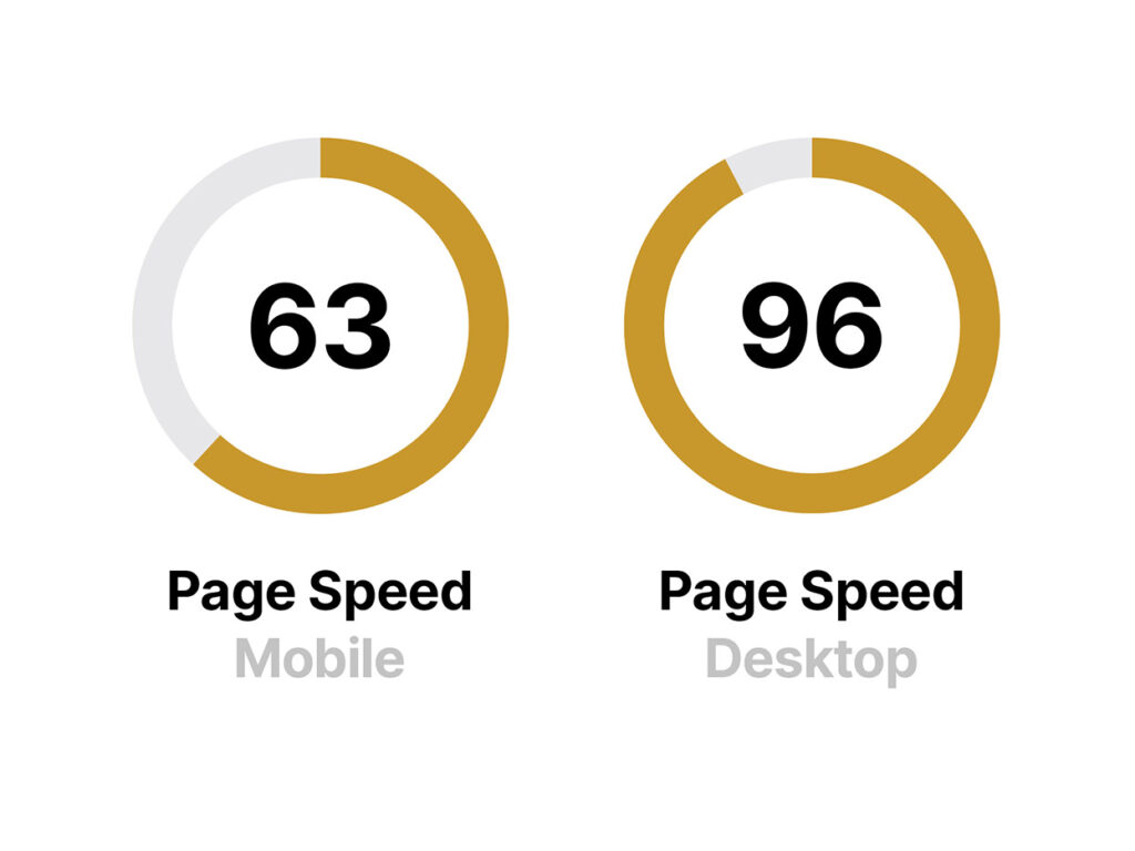
Our site also needed to be super quick: in today’s digital world, speed is king. Leap developer Andrew knows this well. He’s always working to make our sites perform better and faster. “If you want a low bounce rate and engaged users, you need to deliver content to users as quickly as possible,” Andrew says.
“We’ve devoted a lot of care and attention to optimizing our images and videos, developing a solid framework, and being early adopters of new technologies, so that everything loads quickly while looking great.”
An Effortless User Experience
Finally, when developing the new site, we made sure the user would have a seamless experience.
As our devs will tell you, a strong front end is only as good as its back end. Laura, Leap’s lead developer, appreciates how a forward-thinking approach can make all the difference. “When I do WordPress training sessions for our clients, I’m always trying to see things from their perspective. At the end of the day, our goal is to create sites that will continue to evolve and be easily updatable long after launch.”
By anticipating future needs, our dev team creates user-friendly websites that stand the test of time. The same is true for the new Leap site, which is thoughtfully engineered from back to front. Take a look for yourself! And if you like what we did, imagine what we can do for you.
