Propelling a Legacy Brand into the Future
When a conservation hero comes calling, you answer the call.
A dream client
Artist. Naturalist. ‘Conservation hero.’ We knew off the top working with Robert Bateman—and the Bateman Centre team, Board of Directors, and Bateman family—would be a once-in-a-lifetime experience.
Helping to shape the future of an iconic art and nature brand?
You don’t have to ask us twice.
The starting place
The Bateman Foundation is a national public charity launched in 2012 to focus on the artistic and cultural legacy of Robert Bateman and other nature artists. Its purpose? To inspire care for the natural world.
The Bateman Centre opened in Victoria, B.C., in 2013 to support the Foundation’s mandate with a brick-and-mortar hub in the city’s historic Steamship Terminal building, featuring exhibition and event space, a retail shop, and educational programming.
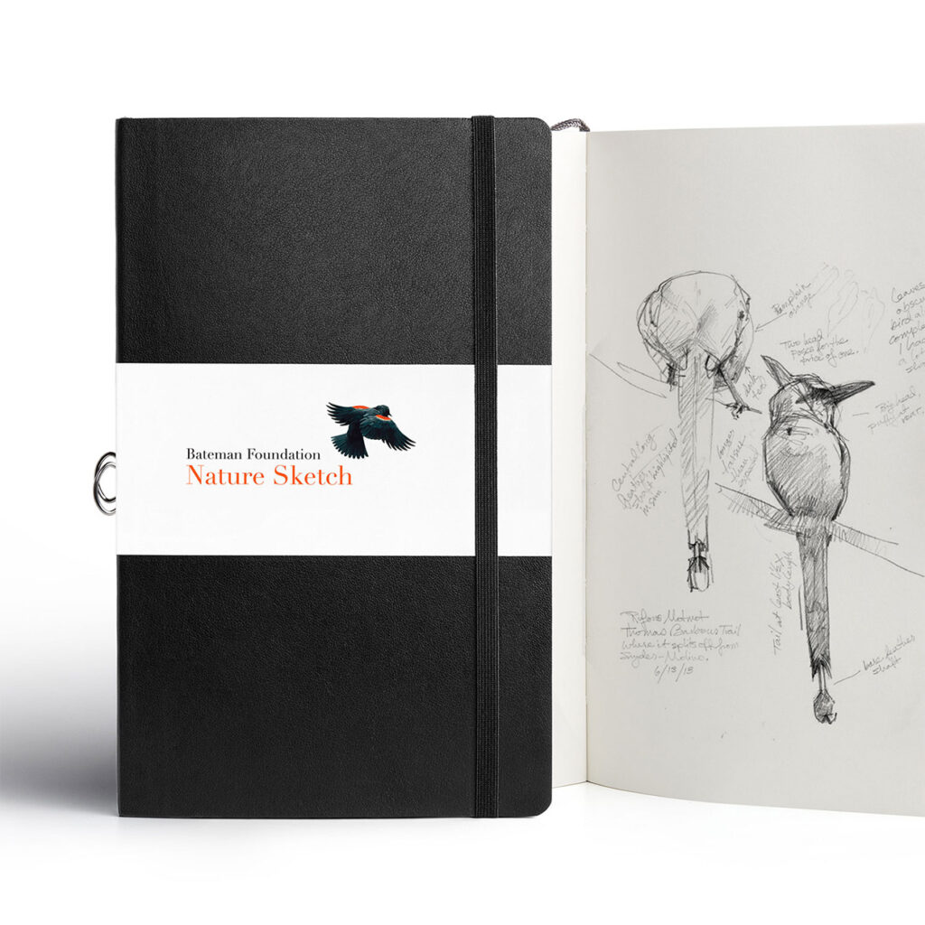
Since then, efforts were underway to grow the brand in Canada through the Centre’s retail and education initiatives. The popular Nature Sketch program encourages next generations to get outside. Rolled out in cities across the country, it aims to reach people (especially youth) where they are.
Home to the largest collection of Mr. Bateman’s work, the Centre was evolving to welcome fellow nature artists, community collaborations, and public programs and events—many tackling topical environmental issues, from climate change and habitat loss, to the rise of consumer culture.
Despite exciting growth, when it came to brand identity and visibility, a number of challenges remained.
Refreshing the Bateman brand
When the Bateman team reached out to us, their wish list was clear: to advance brand awareness within national and global markets; to minimize brand identity confusion; to clarify and simplify the narrative in support of fundraising and public engagement; and, ultimately, to futureproof the brand.
At the time, the relationship between the Bateman Centre and Bateman Foundation was not always clear to external audiences. The Foundation had a limited public profile, despite its philanthropic significance and role in the organization’s ‘why.’ The brand’s visual identity required an update to counter technical limits on its use in the face of a growing geographic mandate.
It was time for a second look.
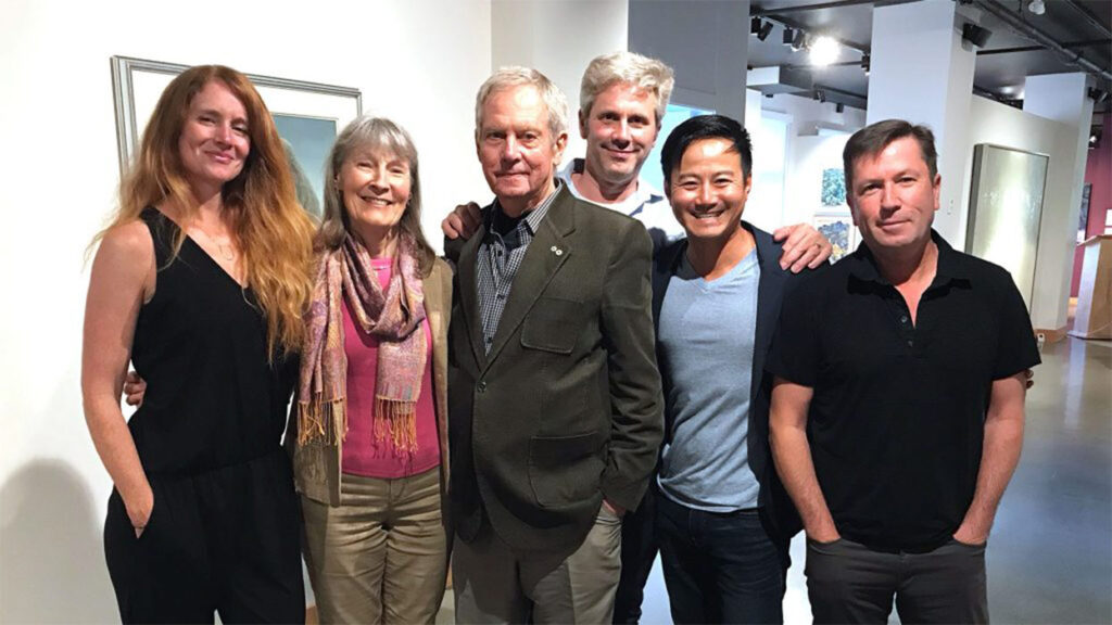
The project team
A powerful partnership
For this one, we teamed up with Sarah Pollard, a long-time Leap collaborator (Wild Renfrew, Rumble Supershake). We put our heads together with Sarah for specialty projects—brand engagements that call for deep strategy and arrow-sharp storytelling. Five years on, we know each other well and have grooved a natural synchronicity—we’re hungry for meaning in our work, selective about the projects we take on, and hell-bent on providing value for our clients.
The opportunity to partner with a contributing brand like The Bateman Foundation—guided by a Canadian arts luminary and celebrating the natural world—ticked all of our boxes.
A cohesive story
Connecting the dots
As we began, a big question on the table was whether the organization was fundamentally an arts, nature, or education brand.
The first step was to distill a narrative framework that defined the relative relationships between the brand pillars to help audiences better connect with the story.
We found answers in exploring Mr. Bateman’s original vision and the Foundation’s core value proposition: connecting people with nature through art.
We zeroed in on the unique ground the organization can claim. It’s one of the only non-profits in Canada primarily using art to promote a connection to nature and the environment.

In the updated brand hierarchy, nature is the driving focus, art is the means of engagement, and education is a powerful outcome.
Growing a more universal brand would mean leading with Mr. Bateman’s nature-first philosophy, and putting the Foundation’s mission front and centre.
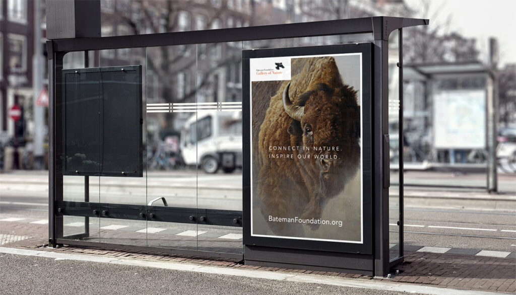
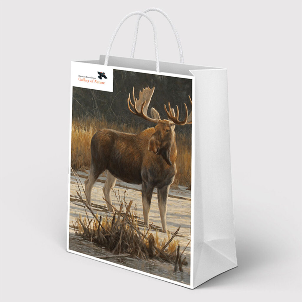
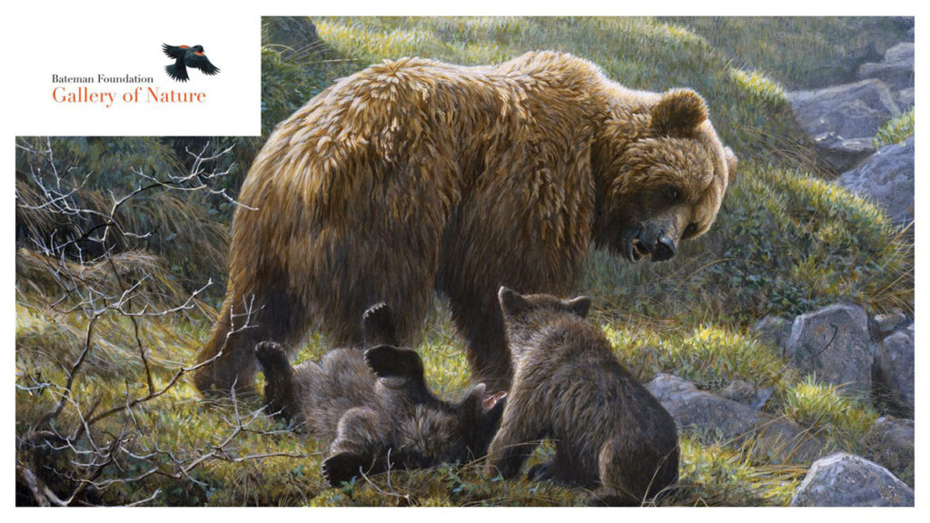
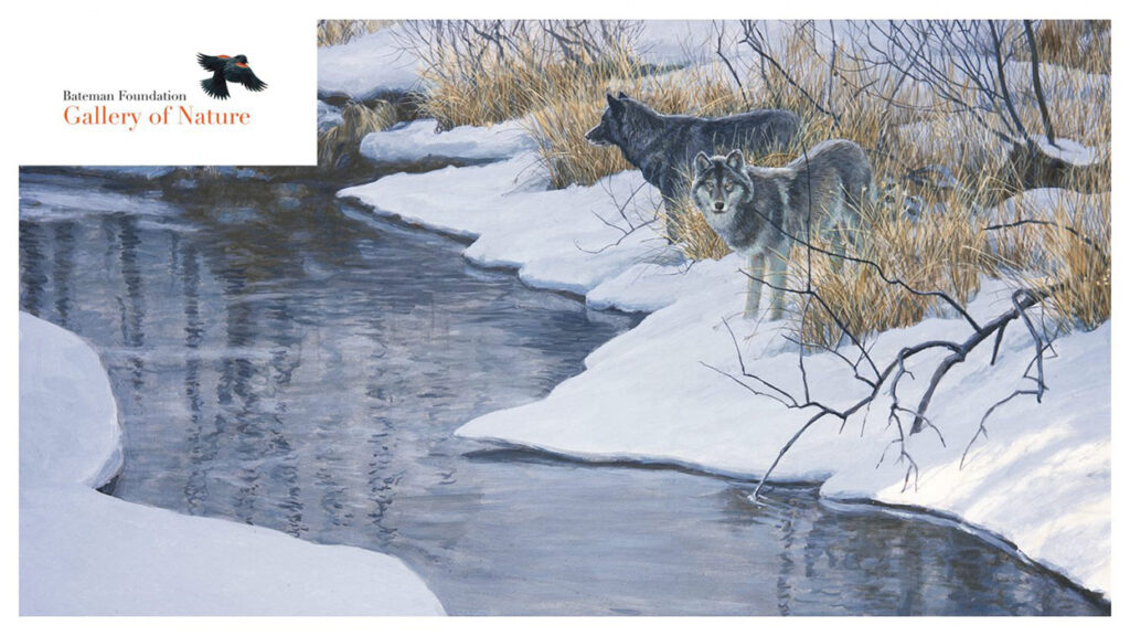
A big idea: Introducing the ‘Gallery of Nature’
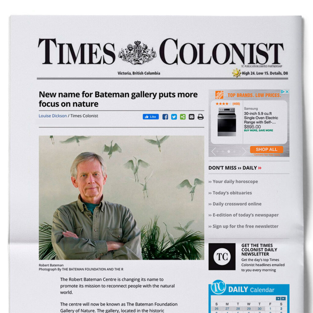
A new name for the Bateman Centre
As we ironed out the narrative, it became clear a more intuitive name was needed to capture the Bateman Centre visitor experience, and to connect it with The Bateman Foundation mission.
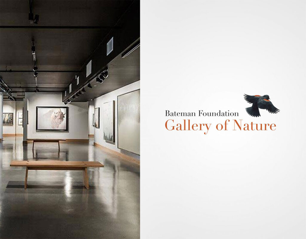
The new moniker links the Foundation with its brick-and-mortar experience. It unites art and nature in a single, compact convention. The emphasis is nature—the heart of the Foundation’s mandate—with art (‘gallery’) in a supporting role.
Straightforward and memorable, it’s a name external audiences can comprehend at a glance, and reflects the natural language Bateman Centre visitors were already using to describe their experience of the exhibition space.
It retains the Bateman stamp, but resonates with audiences whether or not they are familiar with Mr. Bateman’s work—important, given the brand’s growing demographic reach and legacy goals.
A descriptive choice, it clearly communicates the offering, and gives prospective arts and nature lovers a reason to engage. Applied in street-level signage, it’s a draw for local destination and tourism traffic.
The ‘gallery of nature’ is also a neat metaphor for the magic of the natural world.
The golden thread
A ‘living’ logo
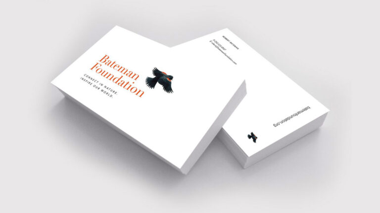
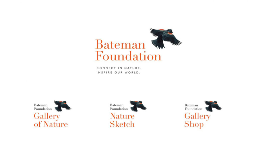
The original Bateman logo featured the image of a blackbird derived from Mr. Bateman’s painting “Red-winged Blackbirds and Rail Fence” (1976). Beloved as the icon was, there were gains to be made when it came to optimization and scalability. The original brand typeface had yet to tell a story.
The new visual identity bridges the brand’s past and future. It combines an intuitive font with a reimagined blackbird icon, offering a ‘golden thread’ of continuity between the modern brand and Mr. Bateman’s founding vision.
We digitally recreated the red-winged blackbird and conceived it in mid-flight. We refined details of the bird’s feathers and ensured technical changes supported a variety of uses, while honouring the original work.

We paired the updated songbird with a French neoclassical typeface. More than 100 years old, Didot is a timeless font with a modern feel. Poetic and clean, it’s a perfect fit for a legacy brand.
A burnt sienna pigment—there in the icon and typeface—reinforces the brand’s natural, earthy tones. A staple in painting, the hue directly connects the brand’s naturalistic throughline to the art world.
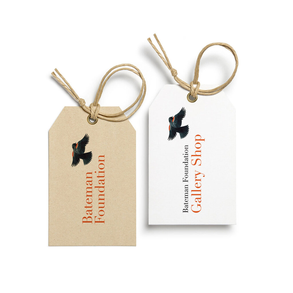
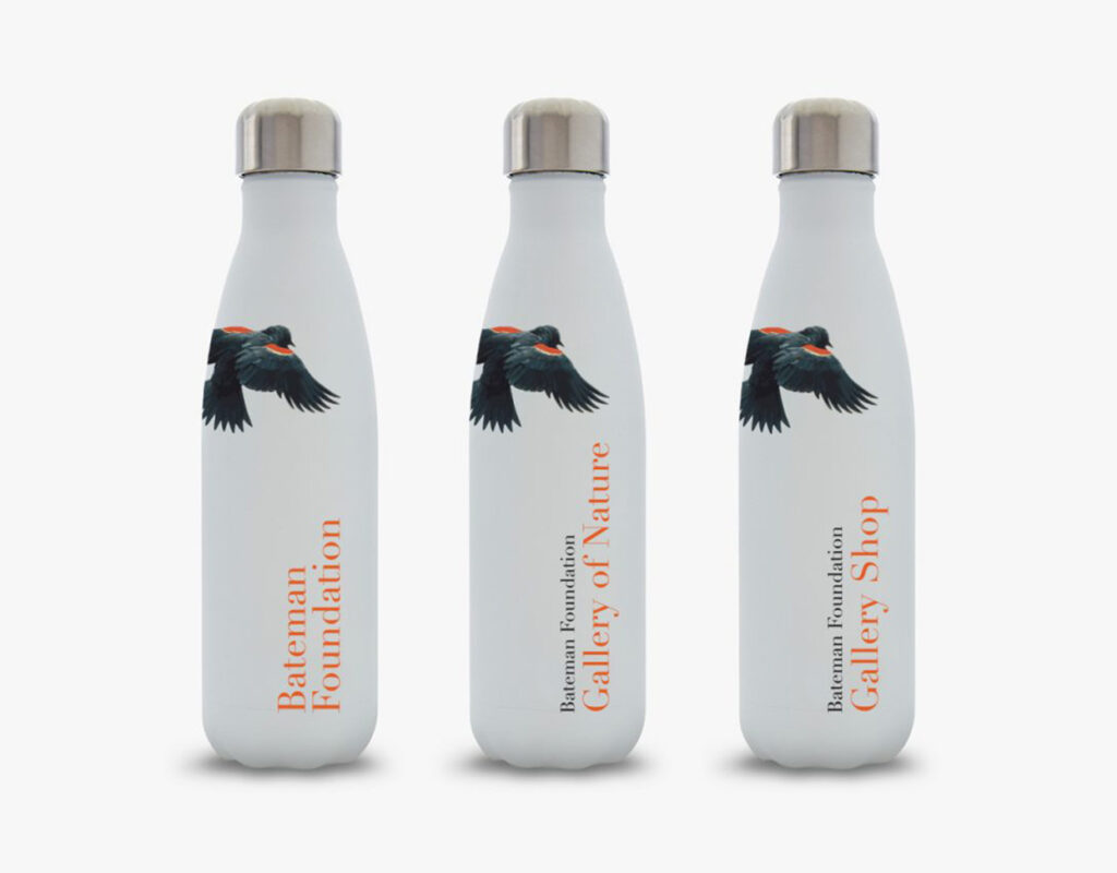
From there, we developed a comprehensive brand system and easy-to-use set of brand standards to help the Bateman team create a unified, consistent, and flexible brand experience.
A call to action
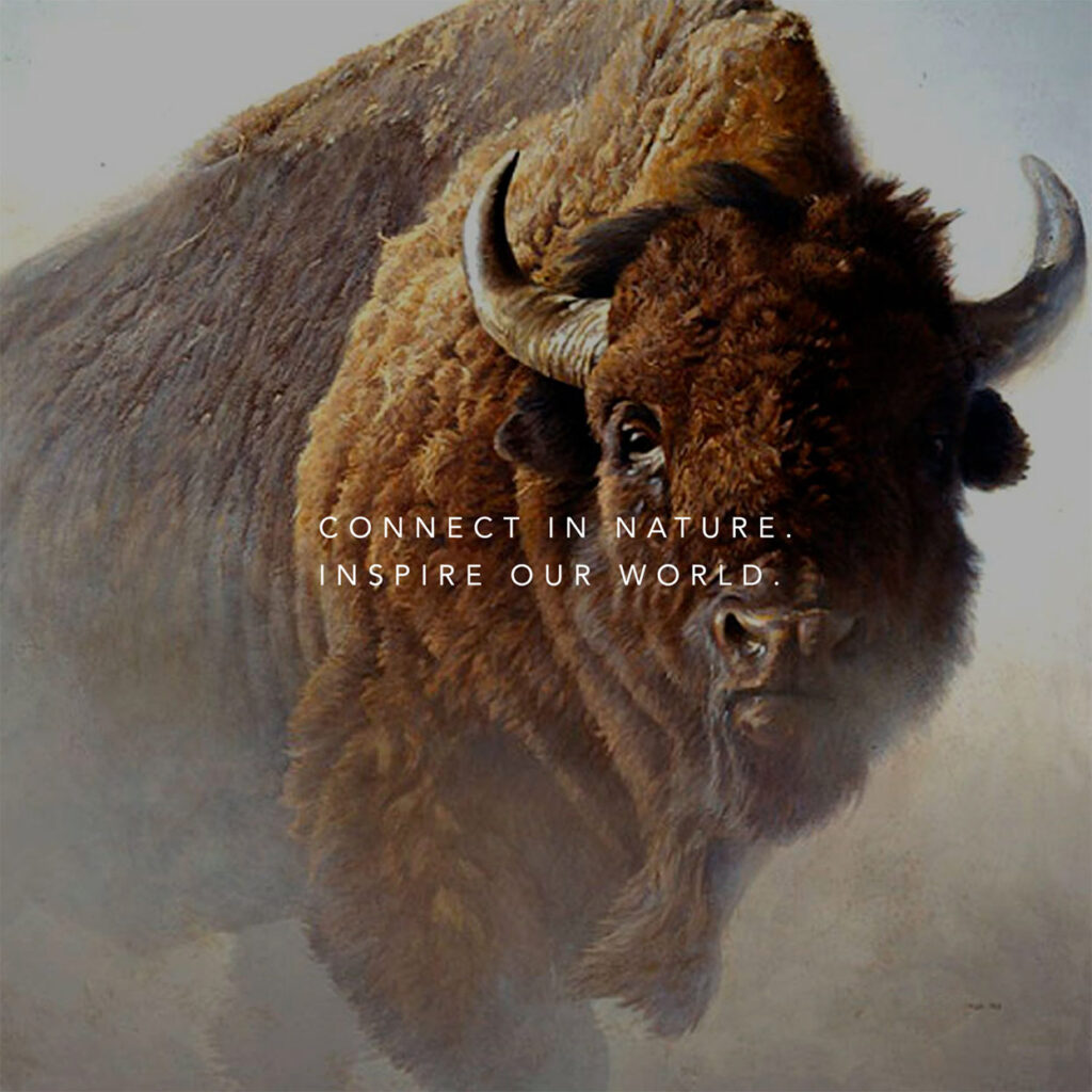
A companion tagline
We paired the refreshed visual identity with a new brand positioning line to be used across all marketing touchpoints. “Connect in nature. Inspire our world” serves as one of those catch-your-breath moments that get under the skin. The tagline is now and future, local and global—a clarion call asking us to embrace the connections found in nature and to consider their power to shape our future. The verb choices ‘connect’ and ‘inspire’ are central to the Foundation’s educational mission: inspiring next generations to change the world.
Acknowledgments
A very special thank you to our project partners: the Bateman Foundation team, Board of Directors, and the Bateman family. We’ve been privileged to work alongside you and to witness the dedication you bring to your mission. To Mr. Robert Bateman whose life’s work continues to inspire people around the globe, we agree—nature is magic.
“Your fresh eyes and incredible creative talents got us to results. It’s clear you spoke to a variety of stakeholders who care so deeply for the Foundation in different ways. We’re gratified to be the beneficiary of your hard work.”
—David R. Schneider, Board Chair, The Bateman Foundation
“You have been instrumental in helping The Bateman Foundation rebrand. You not only understood our vision, you felt it.”
—John Bateman, Vice Chair, The Bateman Foundation
“For any organization trying to transition to a new vision, brand, and business model, the experience can be complicated in both planning and execution. For the Bateman Foundation, this change was so helpfully managed by Leap and Sarah, who facilitated our rebranding process with a balanced approach of iteration, innovation, and creativity. You dove deep and got input from many of the players and partners associated with our organization, including Mr. Bateman, who was thrilled with the outcome.”
—Peter Ord, Executive Director, The Bateman Foundation